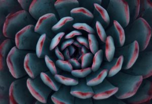
Create colorful plant displays
What do we know of color and how to best use it in interiorscapes? Color theory is often defined on a wheel. Gather up the nearest set of crayons and use the color wheel provided to draw in the listed colors.
The colors we call the primary colors are red, yellow and blue. All other colors are technically mixtures of these. If you form the primary colors into a triangle, mix adjacent colors in equal quantities, you get the secondary colors – orange, green and violet. These six colors are the pure or saturated colors that our human eye perceives.
When you are finished coloring examine some of your findings. For instance, where are red and yellow? The answer is, on either side of orange. Blends of these three colors generally look bright and bold together. Sometimes they are described as the hot colors. Often they are associated with summer color schemes. The other three colors are green, blue and violet and are considered cool colors. They make nice winter garden blends.
Mixtures of colors
Using the wheel, start with looking at the hot colors of red, orange and yellow. What happens if you should add white to the pure red? You get pink. A pink and orange color combination is generally disliked by everyone. The same goes for pink and yellow mixtures. So while the saturated colors work together, many blends will not. This is where color theory gets complex. Additions of white to color makes a tint. Add black and we get a shade. A hue has a bit of another color added to it. As we move from pure colors to tints, shades and hues, making good mixtures gets more complicated.
As an interior plant technician responsible for placing seasonal flower rotations in your accounts, take note of the color combinations you are creating and remember that in most cases, a blend of one color is going to look more elegant than the mix of three or more contrasting colors. We call this bad mix the “jar of jelly beans”.
Blends, hues and backgrounds
The aesthetic aspects of color and color combinations are complicated by the fact that the human eye sees color differently against different backgrounds. While that seasonal flower looked “salmon” when you sleeved it at the shop, it suddenly looks a ghastly pink in the building lobby with taupe background colors.
Stop and look
The easiest and most important thing to do is to pause and look at the color plantings you care for with a new attitude. Stand back and see the containers with a fresh eye. Stand off to one side and look at the design of it. Forget about watering it for a moment and focus on the overall “look” of the plant display. Walk all the way around it. Ask yourself these questions: “Are the colors blending with the surroundings? Are the colors contrasting pleasantly with each other? Does the container color fit the seasonal flower color? Do the colors reflect the season? How can I improve the overall look?”
It’s important to have fun and choose colors that harmonize together. In the end, you will have a beautiful display that your clients will love!
